Overview
Most football YouTube channels look the same. Slapped-together thumbnails, generic lower thirds, and zero visual identity. Thinking Football was built to be the opposite. I co-founded this All-22 film analysis channel in 2019 with three others, and I lead the creative direction and write the research and scripts that drive each video. Brand identity, thumbnail systems, motion graphics, channel design, and the analytical content itself all come through me before anything goes live.
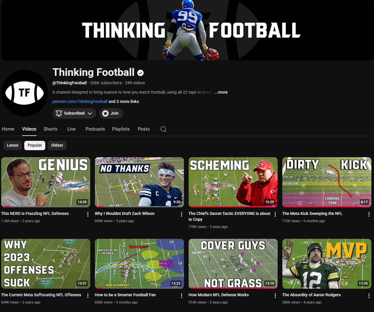
Six seasons later, that foundation has scaled to over 205,000 subscribers and 26 million views without a single brand redesign.
The Opportunity
Football film analysis is a growing space on YouTube, but very few channels do it well. Most default to surface-level breakdowns with low production value. The opportunity was clear: there was room for a channel that combined genuine analytical depth with a level of creative quality that the space hadn't really seen.
We had two tensions to resolve. The first was standing out in a crowded feed: thumbnails get roughly two seconds of attention as viewers scroll. If the image doesn't communicate value instantly, it gets skipped. The second was a dual audience problem: casual football fans browsing YouTube needed approachable visuals, while serious analysts needed to see the channel as credible and worth their time.
Writing & Research
Before any design work happens, the content has to exist. I've played and coached football for close to 15 years, and that background directly feeds the analysis. The team researches and writes the scripts for each video, which means studying All-22 film, pulling stats, identifying the narratives worth telling, and structuring them into scripts that hold attention for 10 to 20 minutes. Having actually run the routes and called the plays makes the difference between describing what happened and explaining why.
The writing process shapes the design. A script about a single player's development needs a different visual treatment than a tactical deep-dive into a team's scheme. Understanding the content at that level means the thumbnails, graphics, and on-screen elements can support the story rather than just decorate it.
Brand Identity
The brand system was built on two pillars: clarity and authority. Football media tends toward noise. We leaned into that boldness but gave it structure.
The wordmark pairs a bold geometric sans-serif with tight tracking, giving it a broadcast-network feel without the corporate stiffness. It reads cleanly at every scale, from a 16px browser tab to a full-width banner.
The color palette is deliberately restrained. A deep navy anchors the brand, with a signature red reserved for emphasis and calls to action. This restraint means that when color is used, it means something. A red accent on a thumbnail signals a hot take or a critical breakdown, not just decoration.
Typography follows the same philosophy. One display face for headlines, one body face for supporting information. No decorative fonts, no gimmicks. The system trusts the content to do the heavy lifting.
Thumbnail System
Thumbnails are the storefront. Every video lives or dies by its thumbnail, and on a channel publishing multiple times a week, I needed a system. Not a template, but a flexible framework that could produce distinctive thumbnails quickly while maintaining brand cohesion.
The system is built on four rules:
- One focal point. Every thumbnail has a single dominant element: a player, a formation, a stat. No clutter.
- High-contrast type. Text is large, legible at mobile scale, and positioned to complement the image rather than fight it.
- Negative space is sacred. Breathing room prevents the thumbnail from reading as noise in a feed full of noise.
The system has evolved over six seasons, but the underlying principles haven't changed. Early thumbnails were simpler; current ones are more refined and confident. The evolution is visible, but the DNA is the same.
Video Graphics & Motion
The on-screen graphics lean heavily on a Madden-style visual language that most football fans already understand intuitively. Route trees, coverage shells, and blocking assignments are drawn in a way that feels immediately familiar, even to viewers who have never studied All-22 film before. That familiarity is the whole point. It lets us explain complex concepts like coverage rotations or protection schemes without losing the audience in the first five seconds.
Channel Design & Art Direction
Beyond individual videos, the channel itself needs to feel like a destination. YouTube banners, end screens, playlist thumbnails, and cross-platform assets (Twitter headers, Patreon graphics, community post templates) all maintain the same visual identity.
The channel art follows a seasonal refresh strategy. The core brand stays locked, but surface-level elements rotate to reflect the football calendar: a clean, optimistic treatment for draft season and a high-energy palette for the regular season. These refreshes keep the channel feeling alive without requiring a full rebrand.
Social assets are designed as extensions of the YouTube identity, not separate entities. A Twitter header should feel like a zoomed-in slice of the channel page. Patreon tier cards use the same type system. Consistency across platforms compounds recognition over time.
Results & Impact
The creative system didn't just make the channel look professional. It became a competitive advantage. In a space where most channels look interchangeable, Thinking Football's visual identity made it immediately recognizable in search results, recommended feeds, and social shares.
Growth has been steady and organic, driven by the combination of strong analysis and a brand that earns trust at first glance. The channel has built a dedicated community across YouTube and Patreon, with viewers regularly citing both the production quality and the depth of research as reasons they subscribed.