Overview
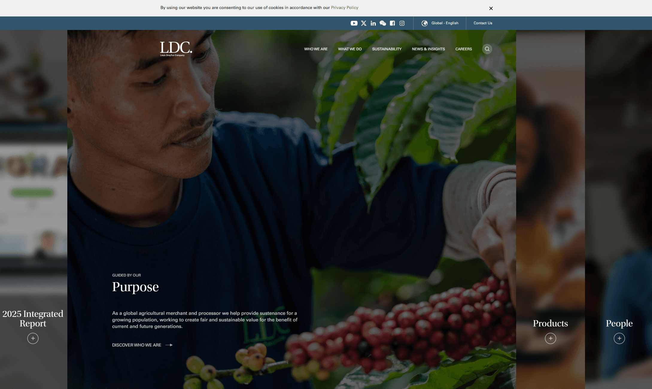
Louis Dreyfus Company is one of the world's largest merchants and processors of agricultural goods, operating across the entire value chain from farm to fork in over 100 countries. They needed a digital presence that matched the scale of their global impact while communicating a clear commitment to sustainability.
Working with Simplicity Partners, I led the UI and interaction design for a comprehensive website redesign, translating detailed UX sitemaps and wireframes into a polished, responsive experience.
The Challenge
LDC's existing site struggled with a common corporate problem: it said a lot but communicated little. Dense content about global operations, sustainability initiatives, and partner relationships was buried in a structure that hadn't evolved with the business.
The redesign needed to achieve three things simultaneously:
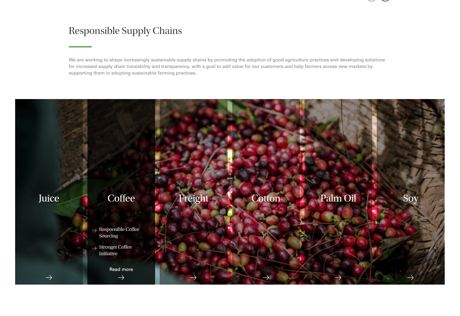
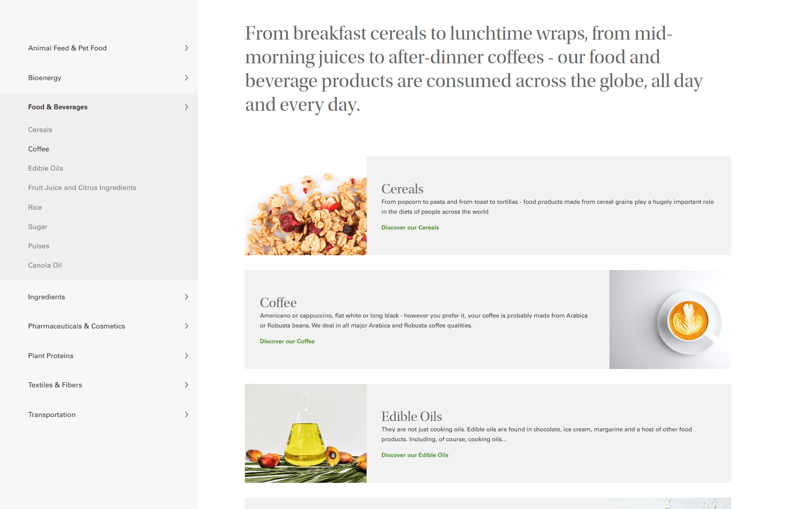
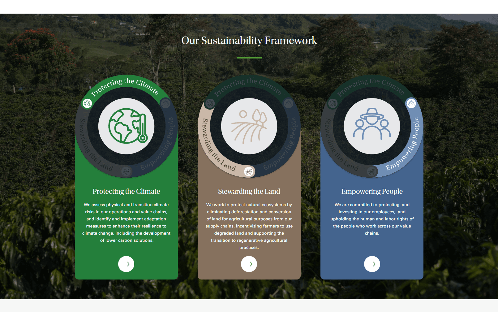
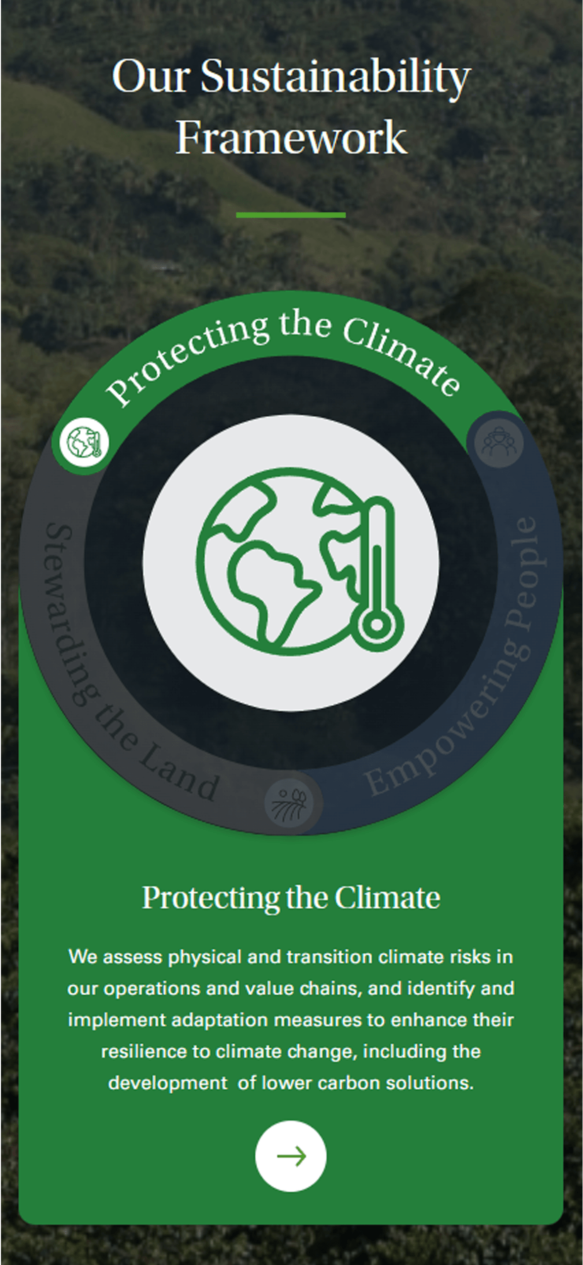
- Make sustainability tangible. Move beyond corporate boilerplate to show real impact across LDC's value chain.
- Serve multiple audiences. Investors, partners, prospective clients, and future talent all needed clear pathways.
- Show how close to home LDC is. Most people have never heard of LDC, but their products touch everyday life. The site needed to make that connection tangible.
Design Approach
Picking Up at the UI Phase
I joined the project after the UX team had delivered detailed sitemaps and wireframes. My focus was translating that structural thinking into a visual system that felt both authoritative and approachable. A balance that matters when you're a 170-year-old company trying to talk about the future.
Visual Language
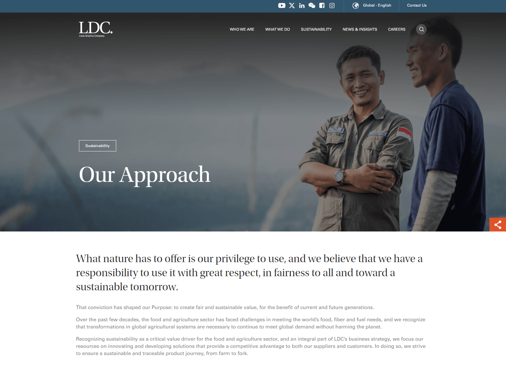
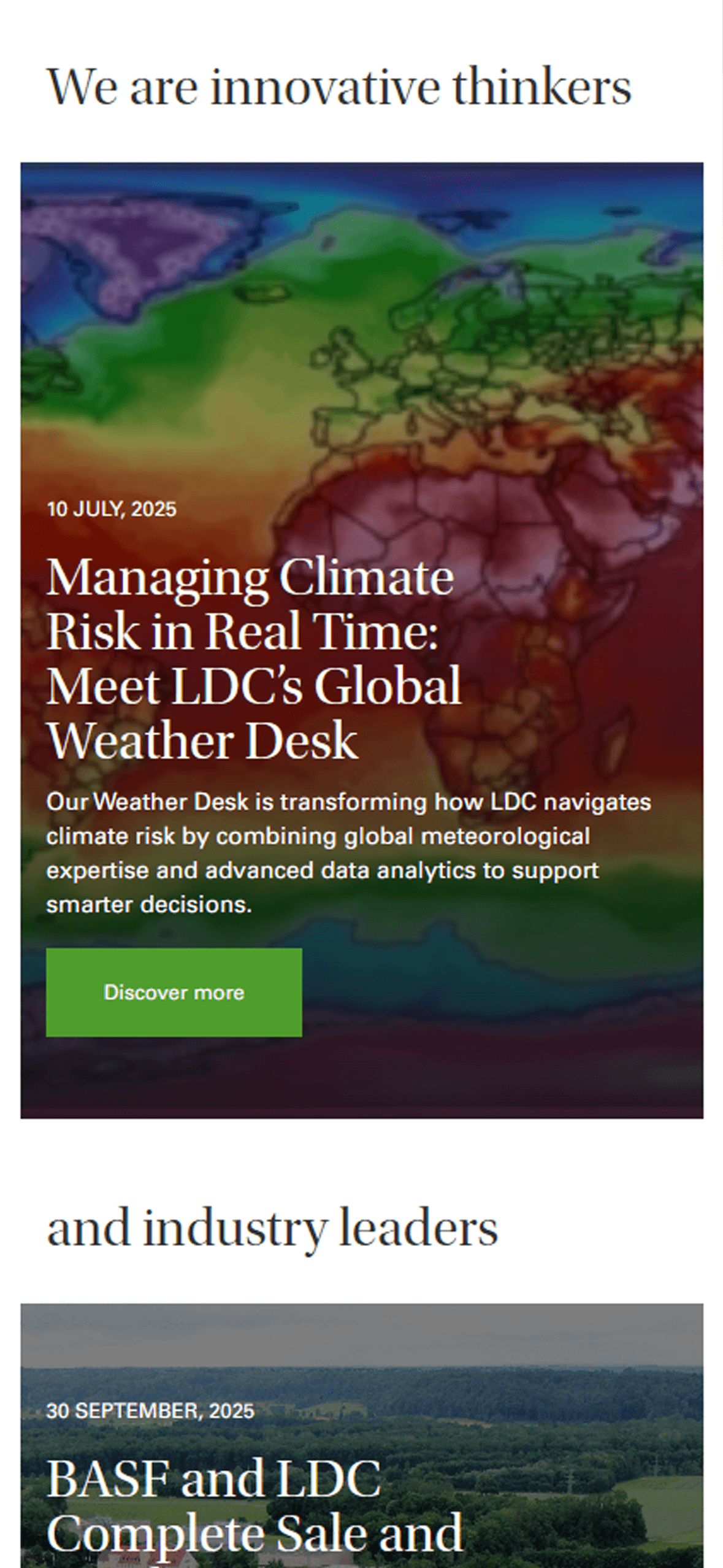
The design leans on editorial-quality photography and generous whitespace to let LDC's story breathe. A restrained colour palette rooted in natural greens grounds the sustainability narrative without feeling heavy-handed. Typography balances corporate gravitas with modern readability across all screen sizes.
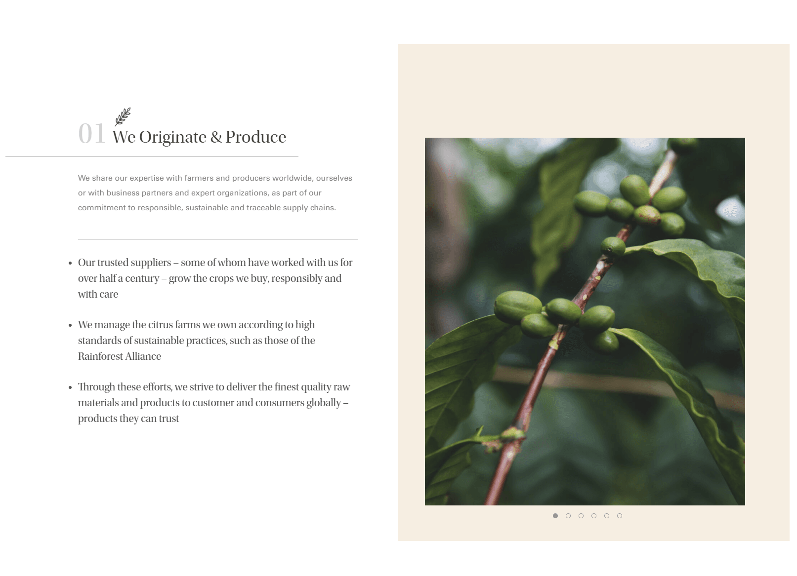
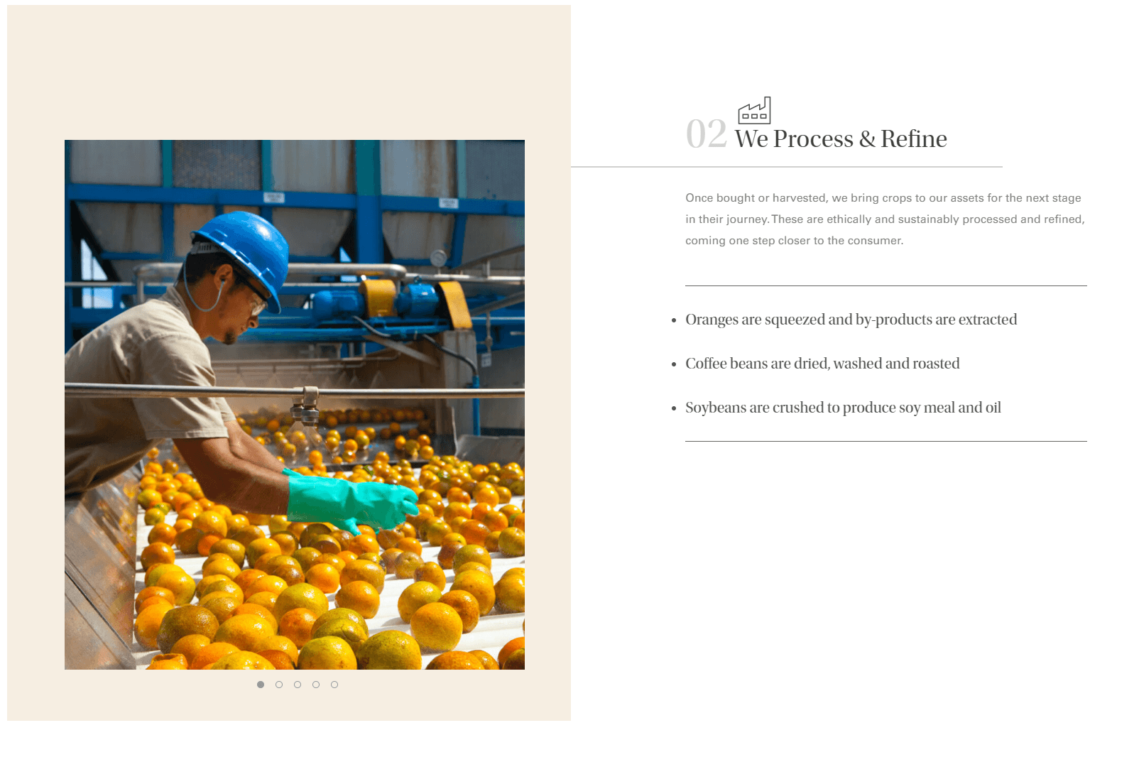
The Value Chain as Narrative
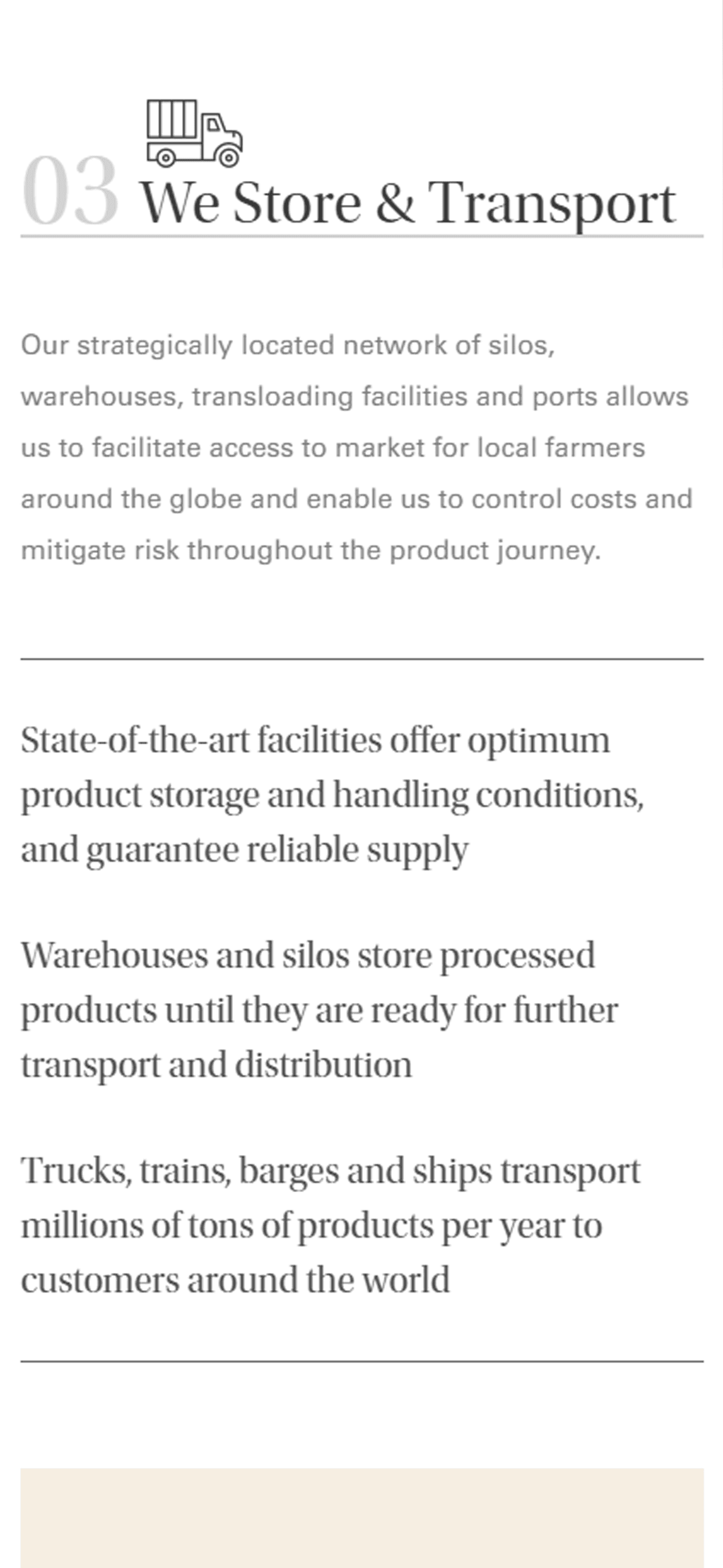
Rather than burying sustainability in a dedicated section, I wove it through the entire experience. Each stage of LDC's value chain, from sourcing to processing to distribution, is presented as its own chapter, showing how sustainability decisions compound across the supply chain.
Global Reach
LDC operates in over 100 countries. Their workforce, partners, and customers span every corner of the globe, accessing the site from trading floors in Geneva, farms in Brazil, processing plants in Indonesia, and offices across North America, Europe, and Asia.
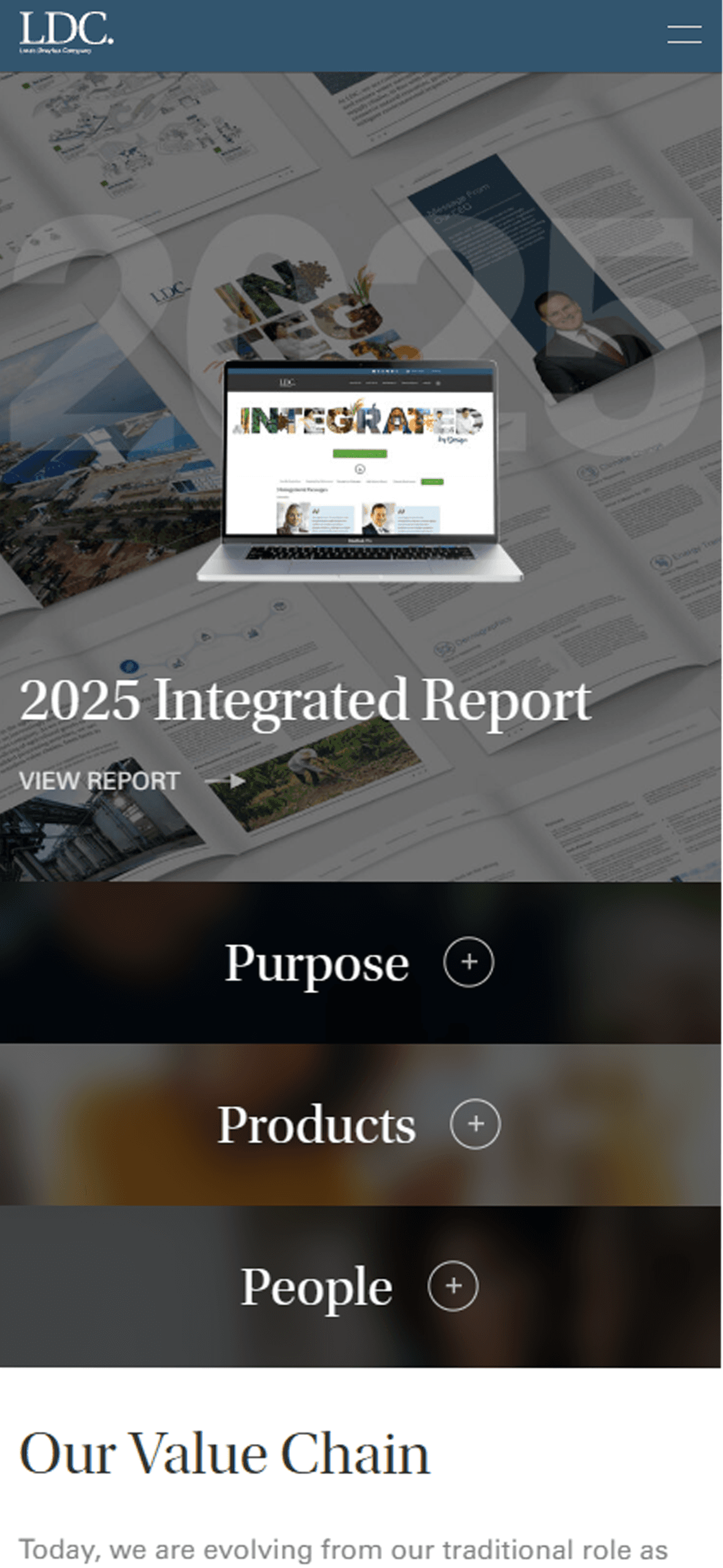
The site had to work for all of them. That meant designing across four breakpoints with layouts that are reworked at each size rather than just reflowed. Content-heavy pages restructure into stacked cards on smaller screens. Photography adapts its crop across devices to maintain impact. Navigation compresses into a mobile pattern that still gives access to the full depth of the site.
This isn't a marketing site for a single product. It's the digital front door for a company that touches the global food supply chain from end to end. Every page had to communicate that scale.
Outcome
The final site delivers a seamless responsive experience that communicates LDC's culture, history, and global reach. It gives investors, partners, and prospective clients a clear picture of how LDC operates across their value chain, and why their approach to sustainability is more than a footnote.
The biggest design decision was treating sustainability as a thread through the entire site rather than a siloed section. It shifted the narrative from "we also care about sustainability" to "sustainability is how we operate."